Hi, we’re Seated.
The future of what ticketing should be.
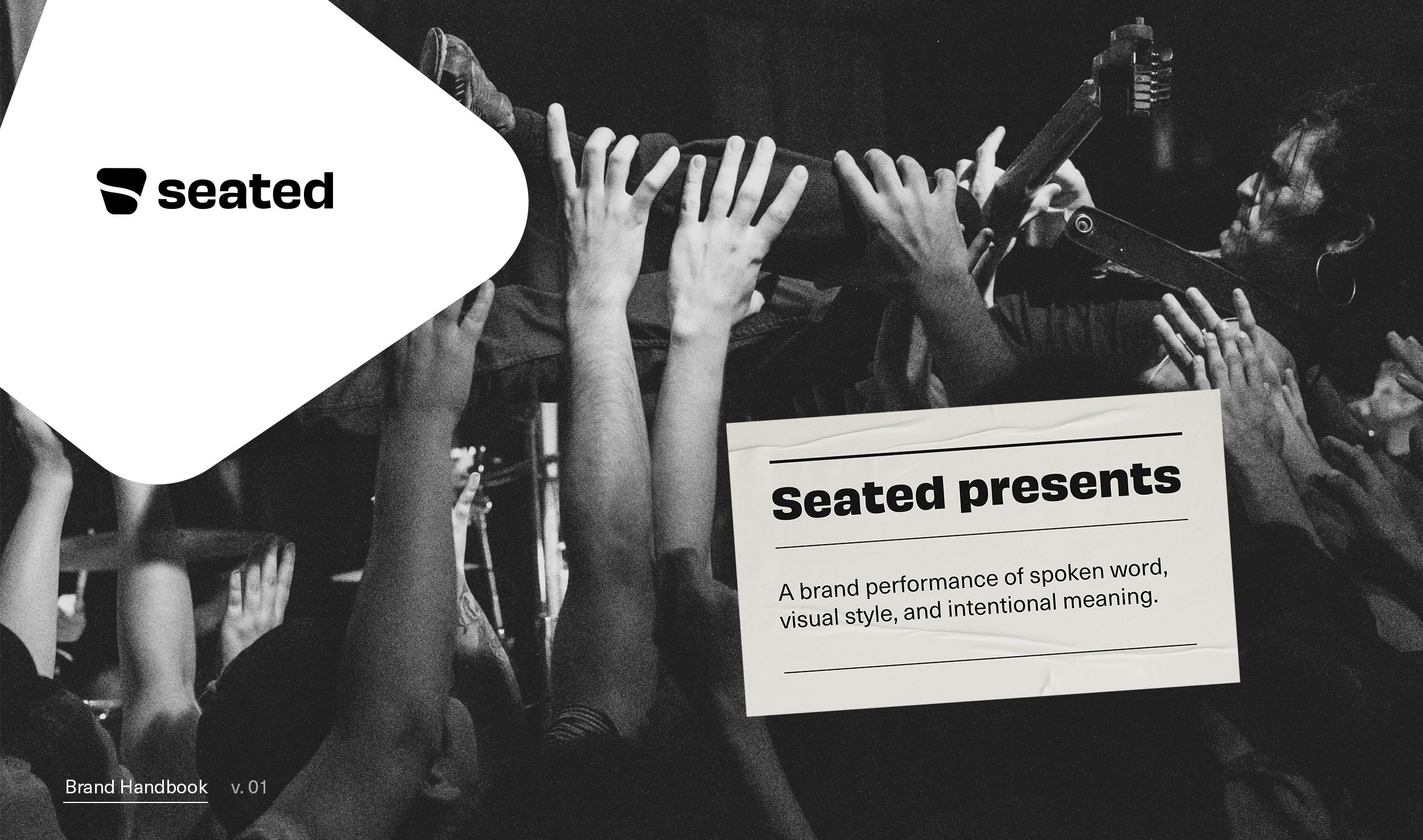
This handbook has been created to guide the outward communication and design of the Seated brand. It introduces our new identity and explains the guiding principles for using the elements of our brand. The Seated identity is more than a single mark—it's a rich system that works to balance technology with humanity and to embody the uniqueness of our product experience.
The way we look, sound, and behave is a reflection of who we are.
The purpose of this document is to inform and guide. It will provide the necessary information you need to create communications for Seated.
Table of Contents
01 - Manifesto
02 - Brand Pillars
03 - Brand Ethos
04 - Our Concept
05 - The Seated Way
06 - Messaging & Voice
06 - Visual Assets
07 - Brand Expressions
Seated is an escape from the noise in ticketing to the sound of the performance. We give voice to the true fan and the stage to the artist.
Seeing an artist, live on stage, is one of the rare occurrences in life that connects with where you are in that moment and stays with you forever; each performance linked in memory. Other fans have joined you for this performance, but this is your experience. Just you in the darkness, your attention placed just ahead of you: the artist, in the spotlight. The sight, their sound, the source of your fandom you’ve come to represent.
Only one thing stands in your way of this experience: access to tickets for their show. Seated is the future of what ticketing should be: an effortless experience that does the work for you, with exclusive presale access so you never miss a show. From the Monday announcement to the Friday release, we connect the true fans with the artists you love.
Enjoy the show.
Brand Pillars
Our mission
Seated is the effortless ticketing experience for the true fans.
Is it good for the fan?
What we do
We power the tours and performances of the world’s top artists for every taste, mood, and mode.
The artists are the main draw.
Our purpose
Seated removes the noise in ticketing so you can enjoy the harmony in live performance.
A rare occasion that counts.
What we’ve created
A text-based way to be the first to know about events and exclusive presale access.
An opt-in experience for the mode that matters most: securing a ticket to the show.
Our role
Seated puts the power in the hands of the fan so they never miss a show.
Who has time to queue for tickets at 10am on a Friday?
Our promise
We easily get you into the shows you want to see through access to the artists you follow.
A memorable ticketing and show experience.
Brand
Beliefs
1. We fight for the true fan.
No one should have an unfair advantage.
2. The only thing you should have to opt into is the artist.
We’re here when you need us, working behind the scenes to get you access to the shows you want to see.
3. The tickets should come to you.
From the Monday announcement to the Friday release, we’ll get the tickets for you.
4. The artists are their own brands.
Bring the artist and the tour to the fore in a way that fits their brand, and the fans will follow.
5. Real people, real performance.
Our ticketing experience is frictionless, but the people behind Seated build relationships with each artist and meet the needs of every fan.
Brand ethos:
Equanimity
For the fans
Everyone should have the chance to see the artist they want. No one should have an unfair advantage.
For the artists
We support any artist, any venue—whether they bring a huge fan base or they're up and coming.
For the category
We’re not here to force new behavior. Conversational commerce with an opt-in mantra delivers what's good for the artist and the fan.
Our core concept

A visual device has been created to represent the idea of connection between the true fan and the artist, powered by Seated.
Inspired by the iconic seat map universal to performance venues, the shape is a point of connection; a place where we frame the shared moment. It builds upon the key elements of the venue (section, seat, and stage) to put the artist in frame across all brand and product communication.
Frame
This frame can stand alone as the fan connects to the artist through their preferred channel and device. An artist can be highilghted in photo or video form by using the device as something to engage with the audience.


Shape
The frame can also be paired with a secondary shape to connote color tied to that artist’s brand.

Motion
Just as live performance has an organic nature to it, so does this device. Subtle motion can bring a new dimension to make the emotional connection tangible and to connote recency, each point in time different than the next. Over time, data can also be considered for further dimension. For example, variance in size (artist popularity), position (geo location of venue). The basic shape however, should always remain the same.

The Seated Way
Brand behavior
Seated is here when you need us, taking a backseat when you don’t.
Sit back and avoid the queue, then get ready for the show.
Brand experience
The moment of anticipation holds the emotion — before this show and the next one.
Tickets in hand, show in mind.
Personality
Our personality informs how we speak and interact with the audience.
We are:
Human, Approachable, Trustworthy, Relaxed, Curious.
We're always human and approachable and want to build trust through our communication. When the audience is in the mode of gaining access or securing tickets to a show, or approaching Seated with a question or problem, we should be relaxed. Our curiosity can lead us to uncover lesser-known insights into artists, venues, and cities which can arm the true fan with knowledge before and after the show. This will forge a deeper connection with the artist’s performance, and with Seated.
Messaging
Approach
How we communicate, both visually and verbally, is informed by the two different states of the Seated experience. The Seated brand adapts to meet the fan where they are and to represent the artist they follow. This fluidity is apparent in how the brand behaves and speaks.
.
Noise free
When the fan is in opt-in and purchase mode, Seated is there to welcome and offer clarity along the way. However, we take a backseat throughout the experience so as to not disrupt the flow.
• Passive
• Set and forget
• Tickets+show come to you
— A product experience with humans behind the automation.
Fluid & adaptive
When the latest tour is announced or an upcoming show is around the corner, Seated is there to build anticipation and excitement around this rare, real life experience. We can be more outspoken and bring an energy to the darkness with the artist and the show in the spotlight.
• Active
• Anticipating the show
• On the edge of your seat
— A brand experience tailored to both fan and artist.
Tone of Voice
At the core of the Seated product experience is text. A one-to-one mobile conversation with the fan while Seated gets the tickets and notifies the fan when everything’s all set. It’s a simple, inherently individual experience, so we take a person-first approach to our voice.
Our voice is: Clear, Conversational, Insightful.
Clear
Keep it simple and direct.
Supporting characteristics: transparent, uncomplicated, concise
Copy examples:
Your number tells us you’re a true fan. We’ll send you a one-time verification, then you’re in.
Opt in for exclusive presale access.
Conversational
Stay in the flow.
Supporting characteristics: personal, present, peer-to-peer
Copy examples:
Be on the lookout for your access code, then tickets to the show will be yours.
Sign up for Autobuy and as soon as tickets go on sale, we’ll snag them for you.
Insightful
Add value to the conversation.
Supporting characteristics: directional, inspired, emergent
Content title examples:
How Every Artist Takes Center Stage on Seated
Amplifying Fan Data That Matters
Language style
Universal
Bands and fans of all types are on Seated, so we want to speak to a broad audience and culture through language that is universally understood, yet make sure we don’t sound generic. We want to stand out from the crowd.
Purposeful
Fans come to Seated with one purpose in mind: to secure tickets to the show. In turn, artists want to see how many tickets are being sold. We can find moments to inspire and provoke, but never at the expense of the task at hand.
Periodic
Seated is an opt-in experience. We choose moments to show up when our audience needs us and aim to provide value no matter the need. We actually shut up when you don’t need to hear from us.
Relevant
Language can tie to the space we’re in: sound (the sonic qualities of words), syntax (e.g. short staccato sentences or denser, artistic phrasing), even content nomenclature. We can be of the moment yet be careful of pop culture references that can quickly become dated.
Perspective & POV
Personal
We want to develop a 1:1 relationship with the true fans. Ensuring each person we can give them access to the show they want to see and that we’ve got their tickets is what matters. We’ll acknowledge their name and details, whether they’ve come back to Seated, and who the artists they’re following.
Local
While we offer global tours, it’s who’s playing nearby that is the most relevant to our users. Over time, we can look for insight into the performer, venue, and city to provide useful knowledge any true fan would want to have.
Directional
We want to always guide our customers through the experience. Focusing on the immediate task at hand yet telegraphing what they can expect to come next will convey trust as being on their side every step of the way.
Anticipating
After tickets are secured, and just ahead of showtime, the moment of anticipation is Seated’s to own. We can offer important ticket/venue details and also show our enthusiasm for the real life experience that’s about to unfold for our customers.
Design Principles
Fluid and adaptive...
The Seated Brand interacts with multiple audiences and represents artists' brands in a variety of different ways. This requires being flexible with our presence and adapting to a wide range of audiences and contexts.
…yet noise free.
When necessary, our brand can take an almost silent back seat to accomodate for the true hero of the moment (typically the artist or the fan and sometimes a Seated employee). In these moments, we are an enabler of a simple and frictionless ticketing experience.
Visual Assets
Logo
Our logo is a valuable element of our visual identity. The following examples are intended to demonstrate how to use the logo across a variety of situations to ensure that it is always presented in the best light.
Main logo lockup
The base logo for the brand is a lockup of our icon and wordmark.

The wordmark
In some cases, the wordmark is used without the icon when the brand needs to be a bit quieter.

The icon
The icon is uses on its own in very specific use cases, such as the Instagram profile image where it will be accompanied by the brand name in the profile itself.
Outside of a social media icon lineup, the icon detatched from the wordmark should never be used in third party messaging.

When needed (i.e. in the website footer or social icon) you may use the icon in a circle. Please use the provided download only and do not recreate.

The Seated Shape is a core brand element. It can be rotated freely and used flexibly across layouts, either as a bold graphic container for imagery, or as a subtle background element.

Clear space guidelines
When placing the logo, make sure that there is ample clear space surrounding it.

Clear space guidelines apply to the icon as well.


Logo sizing
In order to maintian legibility, the wordmark and icon should never appear smaller than these minimum sizes.
Unapproved
uses
The success of the brand depends on the logos maintaining a consistent appearance in all communications.
In order to preserve the integrity of the logo, the following examples illustrate how it should not be used.
The following rules apply to the full logo as well as the individual icon and wordmark.
01 - Do not change the color of the logo or elements of the logo.
02 - Do not put the logo in a container or shape.
03 - Do not overlay gradients or effects.
04 - Do not rotate the logo.
05 - Do not skew or alter proportions of the logo.
06 - Do not place the logo on low contrasting colors.
07 - Do not place the logo on busy or complicated backgrounds.
08 - Do not add effects to the logo.

Color Palette
Our colors have been carefully selected to respond to our brand voice. The below palette is the basis for our brand system: a refined black and white with a soft blue as accent color.
When the brand acts as a support to artists, we leverage mainly our black and white and respond to the palette of the artist (in lieu of the blue).
White Rabbit
Hex - FFFFFF
RGB - 255 / 255 / 255
CMYK - 0 / 0 / 0 / 0
Pantone - White
Fade to Black
Hex - 151515
RGB - 21 / 21 / 21
CMYK - 73 / 67 / 65 / 80
Pantone - Black 6
Moody Blue
Hex - A4DDE0
RGB - 164 / 221 / 224
CMYK - 34 / 0 / 13 / 0
Pantone - 317C
Typography
Consistent use of typography is a critical to bringing the brand to life.
Our system pairs a expressive sans serif headline font (Obviously) with a versatile, workhorse secondary text typeface (Neue Haas Unica).
Headline text: Obviously

From OhNo Type Co.:
As a lover of hand-painted signage, I have a dark side I rarely mention: I have a soft spot for vinyl too. I love to see Impact made extremely wide, and Antique Olive Nord squished to comical proportions. I love when the vinyl starts peeling up on the sides, and the corners are the only bits that manage to remain adhered to the substrate. I love the billboards for HEMPCON, TATTOOCON, and all the other CONS that advertise with black on an obnoxious shade of pink or neon green.
With all those things in mind, I set out to make Obviously. There are 48 styles for all sorts of feelings. One variable font is included that contains a weight and width axis.
Secondary text: Neue Haas Unica

From Monotype:
Neue Haas Unica is a neo-grotesque sans-serif typeface designed by Toshi Omagari and published through Monotype in 2015. It’s an expanded, digital revival of the long-lost Haas Unica, a typeface that was designed in the late 1970s but later pulled from the market due to legal disputes. André Gürtler, one of the designers of the original Unica, describes it as “sharper than Helvetica, warmer than Univers, cleaner than Akzidenz.”
Compared to Helvetica, Neue Haas Unica has slightly looser spacing and letterforms that are a touch narrower. The family is available in nine weights—ultra light, thin, light, regular, medium, bold, heavy, black and extrablack—each with matching italic styles.
Photography
Photography plays a key role in the overall content and the appearance of our brand. Our selection of photography should be honest, approachable, purposeful, and thoughtful.
The below art direction guidelines are for the photography we capture or source as a brand - while understanding that often in our messaging we make use of photography that is relevant to the individual artists, and our brand takes a backseat creating the frame around their imagery.
All included photography is copyright protected and meant for reference only, not for use.
People
Whether representing the artist or the fan, our brand voice is based in amplifying a real moment of connection: a fan entering the event, an attendee basking in the glow of a live event, or an artist preparing to perform and build that connection. No poses and minimal camera engagement. Crowd shots should be sure to capture faces and subjects, not anonymizing it into a generic group of people.
General notes:
01 - Capture natural and authentic poses.
02 - Capture diversity of gender and ethnicity when possible.
03 - Avoid obvious and stylized front-flash.
04 - Outside of Seated staff imagery, avoid in-studio photography on seamless background. In-situation is prefered.
05 - Focus on individual subjects (both artists and fans) to keep the focus on portraiture as opposed to wide angle generic live event imagery.
06 - Utilize a shallow depth of field for clarty and focus on subject. Long range lens is ideal.
07 - In communication where imagery of the artist is prominent, consider how fan imagery needs to recede so as to not take the focus away from the artist. For this reason, a B&W treatement is applied.

Locations
When capturing imagery of locations, we treat them with the same rigor we do a portrait of a person. In music, location imagery holds emotional weight with its ties to specific events and we want to ensure we capture that emotion - even if it is that of an empty stage.
General notes:
01 - Avoid obvious and stylized front-flash.
02 - Focus on individual still life subjects within the location to keep the focus on portraiture as opposed to wide angle generic live event imagery.
03 - Utilize a shallow depth of field for clarty and focus on subject. Long range lens is ideal.
04 - Pay specific mind to the geometry of the space to capture an engaging composition.

Brand Expressions
The below examples show the brand in use. These function as thought starters and initial references for how the brand system can be used in a multitude of ways.
As is the case with any brand system, individual challenges require individual solutions. The below examples should not be interpreted as strict templates, but as a general guide to use when bringing the brand to life across various channels.
Web


Social


Out-of-home advertising


Swag


Thank you.
We appreciate your commitment to maintaining the Seated brand standards.
If you have any questions regarding these guidelines, please contact: